Call to Action
Discipline: Web Design
Users are bombarded daily with call to action buttons. Some are used properly and some are abused, and blend. A proper use of scale, and contrast to stand out should be considered when using a call to action button.

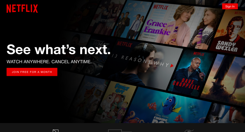
Netflix has great call to action buttons. The contrast, and placement of the buttons make it easy for the user to join, or sign in. They also say “”Join Free for a Month” instead of just “Join” so they include an incentive for the user in their call to action.
Netflix uses a good call to action button when the user scrolls over the image. Below you can see how it looks when browsing Netflix, but once I scroll over Bill Nye, the images enlarges and comes out, and a play button appears. This is a great use of call to action. It is an effective visual prompt to help me not think, but simply click if I want to watch.


http://www.alecanmarketing.com/effective-call-to-action-tips-for-business-websites/
